Meeting the client brief (U3: P5, M4, D1)
Learning Outcome 4 (U3): Be able to carry out post-production techniques and processes for an original media product to a client brief
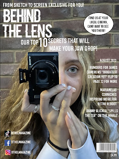
My front cover has been imported in the format of a jpeg.
A jpeg is a graphic image file and has been chosen for my front cover as it is high quality and has a full-color spectrum. Therefore ensuring the best visual experience for the target audience.
My double-page spread has been imported in the format of a jpeg.
A jpeg is a graphic image file and has been chosen for my double-page spread as it is high quality and has a full-color spectrum. Therefore ensuring the best visual experience for the target audience.
Post-production tools and methods used for the Front Cover
1. Spot Healing Brush Tool
I used the spot-healing brush tool to erase any details on the model so it could fit the target audience better. As the model image is quite zoomed in evidently imperfections will be seen by using the spot healing burhs I was able to gently erase these imperfections without causing damage to the image. However, this was used on minor details just to create a more appealing look, changing features of the model felt natural and not fitting to the target audience of youth within North London whom most can not relate to flawless models presented in most magazines. This correlates to the client's brief requirements of producing a new film magazine for North London.
2. Ellipse Tool
I used the ellipse tool to create the puff. The ellipse tool enabled me to make a circular shape that would stand out from the background and other texts. The ellipse tool was beneficial as it enabled me to use a circular shape that conveyed slightly more formality to the result of front cover conventions features, this is because the circular shape creates a more educational and informative visualization. Not only did this enable it to stand out but it also correlated to the ethos of the magazine of being educational and informative. The ellipse tool enabled me to reach the client briefs requirement of distributing the magazine locally as within the puff I used a white background and mentioned where customers can purchase the magazine within North London.
3. Move tool
I used the move tool to place all the cover lines and other assets such as the barcode, price, and social media references in a structure that appeals to the target audience to its full potential. By using the move tool I created a Z-line pattern within the front cover where the heading was placed at the far left, the cover lines were placed along the right, and social media references were placed at the bottom left. This technique is used to appeal to the format in which people read from left to right. The move tool enabled me to reach the client's brief requirements of promoting a film released by an independent company, this can be seen by the second cover line" Marianelas Corniche inspiring work for retro reboot". Ultimately, this cover line is most important therefore moving it to the center of the magazine was crucial.
4. Frame Tool
I used the frame tool for the social media references at the bottom left of the front cover. The frame tool enabled me to ensure each image of the social media logo is the same size and in the same row. Ensuring all three boxes fit for referencing social media applications has a minor effect but is evident to ensure an appealing visualization for the target audience. As the front cover is the first representation of "Behind the lens" ensuring all aspects of the front cover are structured well was important. The frame tool enabled me to reach the client's brief requirement of promoting the magazine for North London as the social media references enable more efficient distribution of the magazine across North London.
Post-production tools and methods used for Double Page Spread
1. Magnetic Lasso tool
I used the magnetic lasso tool to select what I wanted to cut from my background to help my body copy stand out. Initially, the first layer I used on my double-page spread was the double-page spread picture I had chosen which presented my model in a green setting, however, this disrupted the body copy as the green setting restricted it from standing out. The magnetic lasso tool enabled me to articulate which specific areas I wanted to cut out. Additionally, the lasso tool enabled me to reach the client brief as it evidently enabled balanced attention to all aspects of the double-page spread.
2. Eyedropper Tool
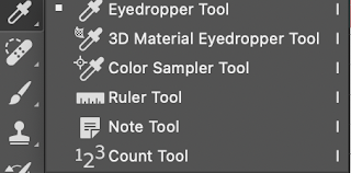
I used the eyedropper tool to create a consistent color palette throughout the double-page spread. This was beneficial as it ensured the colors used within the double-page spread correlated to the aesthetic of the background and the body copy. In the picture used in the background, the model is wearing blue and using blue props, additionally, the body copy about Marianala Corniche portrays conveys conventionally feminine topics such as dress-making. The eyedropper tool enabled me to use the same blue in the props for the questions in the body copy. Additionally, the eyedropper tool enabled me to reach the client's brief requirements of encouraging ideas for wider mass distribution as the use of these colors sub-consciously captivates a variety of people within the target audience.
3. Eraser tool
I used the eraser tool after using the lasso tool to erase parts of the background that were not selected by the lasso tool. Evidently, the eraser tool helps to create a more satisfying visualization for the target audience. Creating a satisfying visualization for the customer is critical as it will increase the probability of them being interested in the content of the magazine. The eraser tool enabled me to reach the client's brief requirements to promote a new film release produced by an independent company as the double-page spread became more appealing using the eraser tool.
4. Hand tool
I used the hand tool within every step whilst creating the double-page spread. The hand tool enabled me to place the body copy, headings, and the image of the image in the right places to create a structure that would portray all sections of the double-page spread. With the use of the hand tool, I lowered the image of the model once I had used the lasso tool to cut the background, this was so I could fit the body copy over the image without disrupting the writing of the body copy. Additionally, by moving the image of the model I created a blank space where both new and current streaming services were presented. The hand tool enabled me to reach the client's brief requirements to reference my streaming services Netflix and Films4U in a format that the target audience would be able to notice easily.
Post-production techniques and processes used that created meaning within the magazine
Report on how we reached the client brief
Para1- explain client brief explicit requirements, target audience
para 2- how the target audience was reached
para 3-how distribution to north London was achieved
para4- how indie movie was promoted
Cinecloud had created a detailed client brief evaluating the targets the magazine should and must reach to launch the magazine. The magazine genre I had chosen to create was film production, this is because the genre of films is always discussed and what the film represents however I wanted to create a resource for people within North London to understand why decisions were made within films and how. This includes mise-en-scene, advanced technology such as CGI, props, and many more methods that are used to ultimately create a film production. Within Cinecloud brief requirements were mentioned some were explicit and somewhere implied strategies to give guidance, nonetheless each decision within the creation of the magazine the client brief had been taken into consideration.
The first explicit requirement mentioned in CineCloud's client brief was to pitch ideas for producing a new online and print-based magazine for North London. To create a magazine for North London I had to consider the lifestyle of people within North London, even before choosing a target audience. North London is a very multicultural location, with a varied and spread-out class system. As I had chosen film production to be the genre for my magazine a fitting target audience had to be decided alongside. My primary target audience is 18-25-year-olds living within North London, these people are young and new to the film industry either studying it in higher education or fascinated by it. The magazine was named "Behind the Lens" as it showcases information that would educationally benefit the target audience. Evidently, the magazine has to be entertaining to keep the attention of the reader so this is done by sharing information through interviews, Q and A's to stay away from the conventional article format where information is simply being said this information is being discussed which enables the reader to become more engaged with the content. To fit the target audience of North London the content includes famous people but also people who have achieved things but may not have been given as much recognition; the use of "inspiring and aspiring" people create a variety of opinions and experiences that people in North London may relate to.
The second explicit requirement mentioned in Cineclouds client bride was to promote a new film produced by an independent company. As shown in my double-page spread I decided to reach this requirement by interviewing the customer designer of my chosen film "Retro Reboot". Marianela Corniche the costume designer of "Retro Reboot" was fitting for the target audience as her guide to success is very different from others. She originates from a small village in North Italy where she elaborates on her guide to success but also within the interview informs the reader of costume decisions she made for the character Char in the film "Retro reboot". I had decided to promote the film in the format of an interview as it's more personal and Marianelas Corniche's road to success is very similar to those in North London as she was fascinated by design and the film industry but had no connections into the industry. by connecting the film and personal experiences the magazines informs the reader more engagingly.
Another explicit requirement mentioned in the Cineclouds client brief was to initially locally distribute the magazine. Locally distributing the magazine meant also marketing the magazine specifically to North London residents. The marketing technique used to promote the magazine is social media, however, specifically focusing on Tiktok. TikTok has a very specific algorithm that creates a personalized method that shows videos to viewers that can relate to the video, in the sense of location, topic, style, etc. Therefore uploading short videos on Tiktok promotes the magazine "Behind the Lens" the videos are being shown to people within North London with the help of the TikTok algorithm. Evidently, the magazine was to be sold in local newsagents, food shops, post offices, etc. These places are reliable distribution locations as they are places that are usually within people's routines. However, to specifically reach the target audience we decided to sell the magazine in Cinemas as well in order to locate those most interested in film production.


Comments
Post a Comment